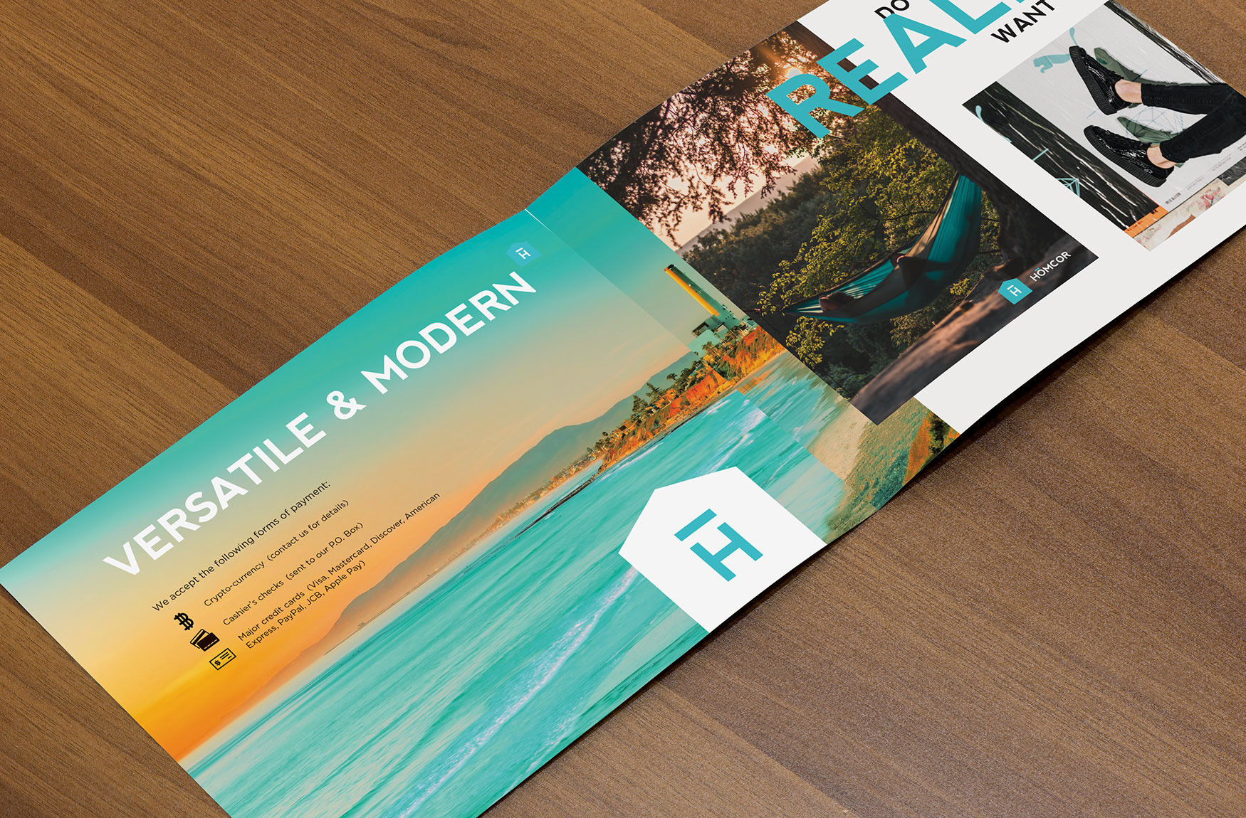
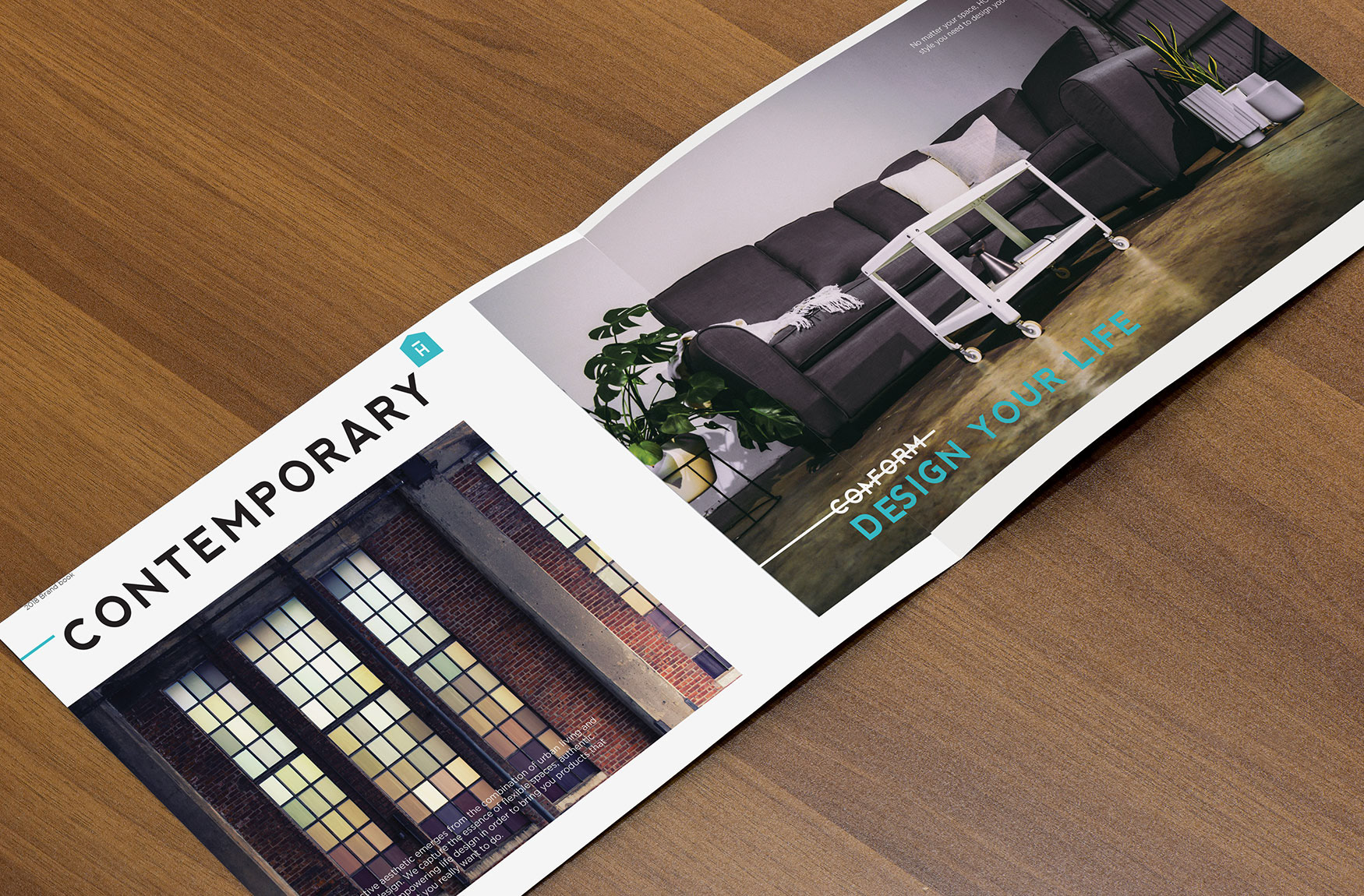
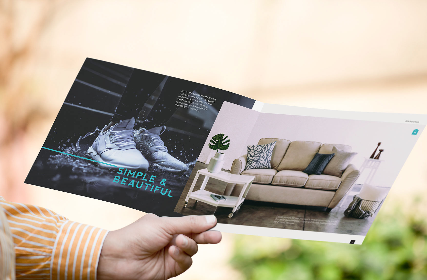
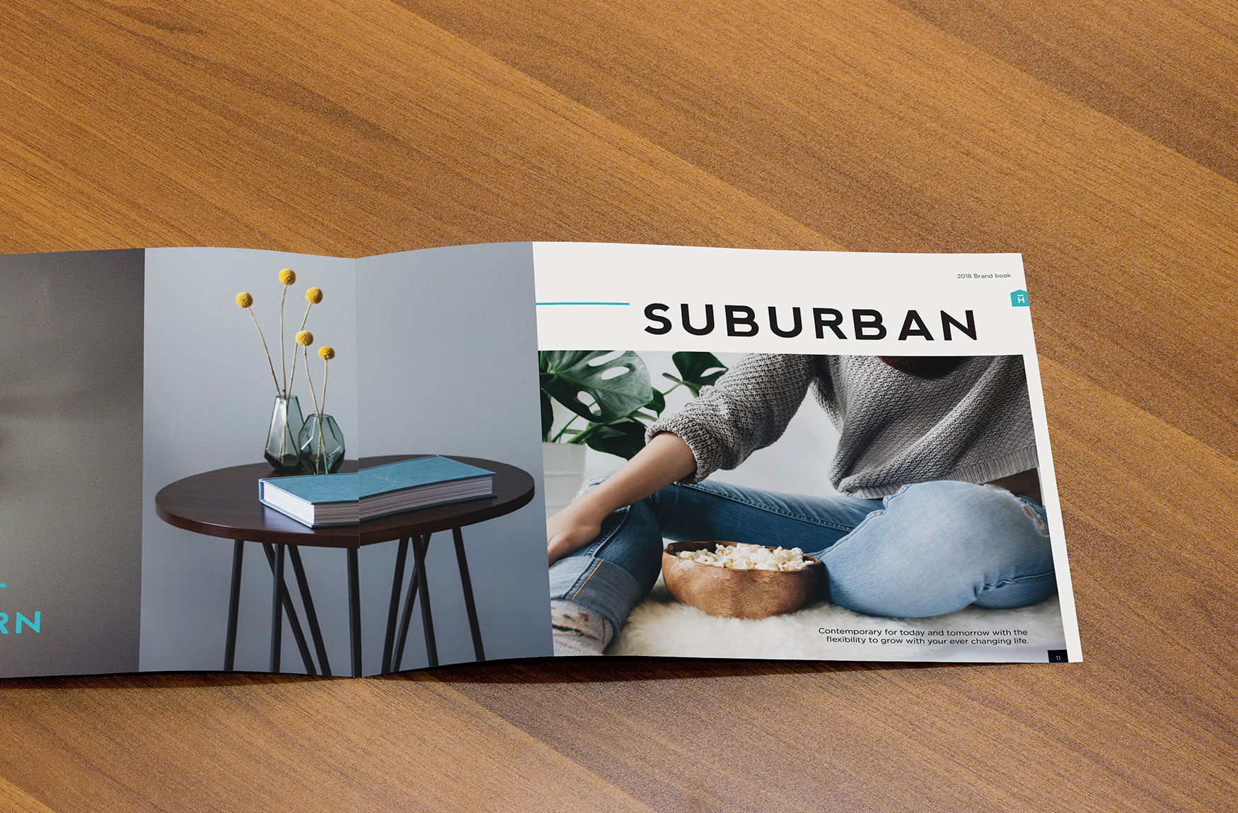
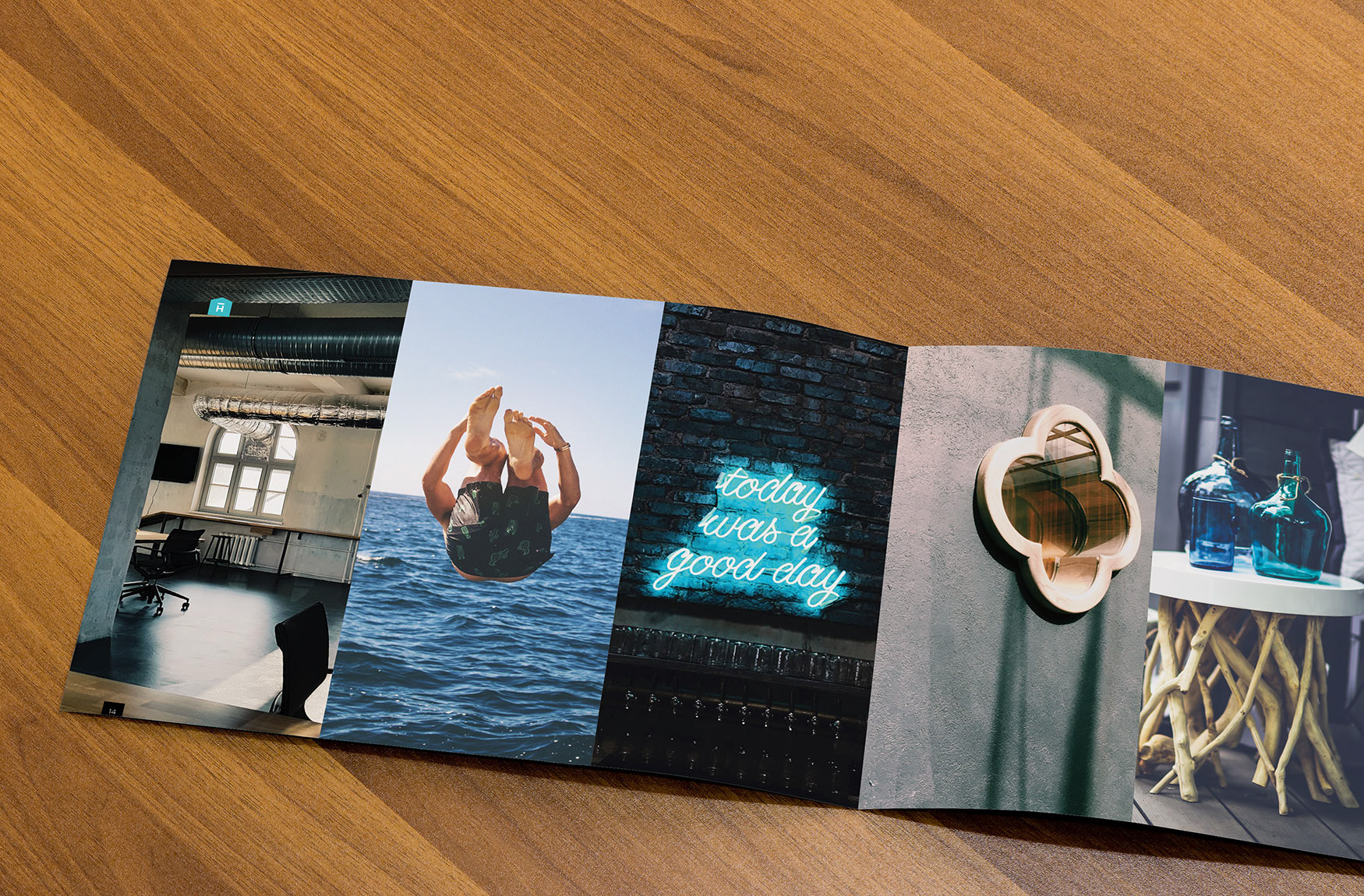
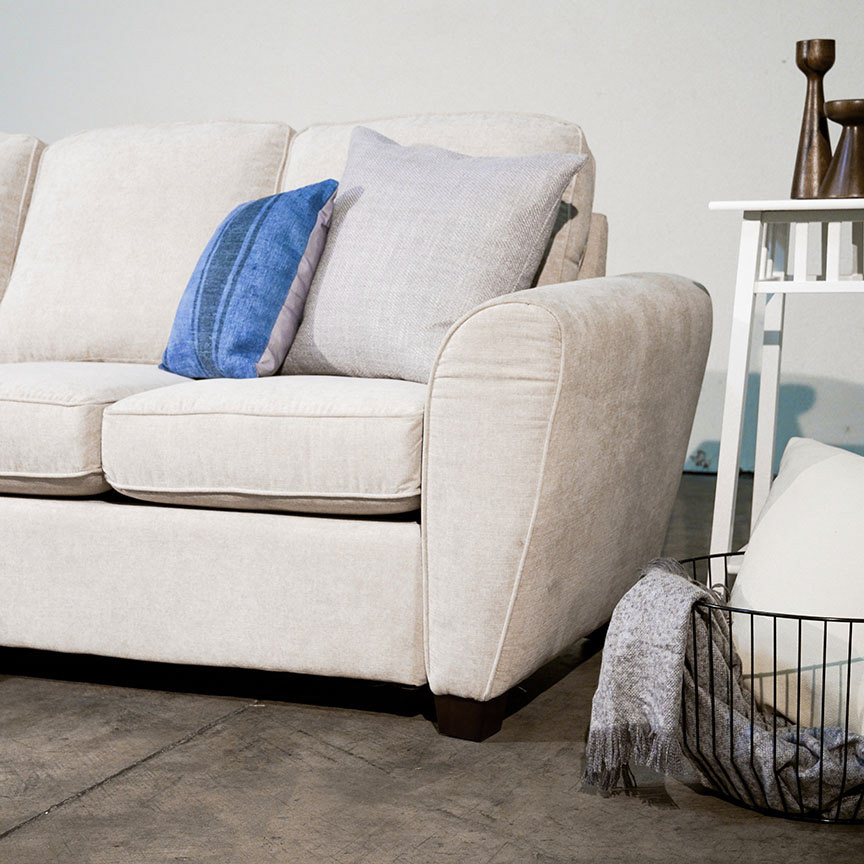
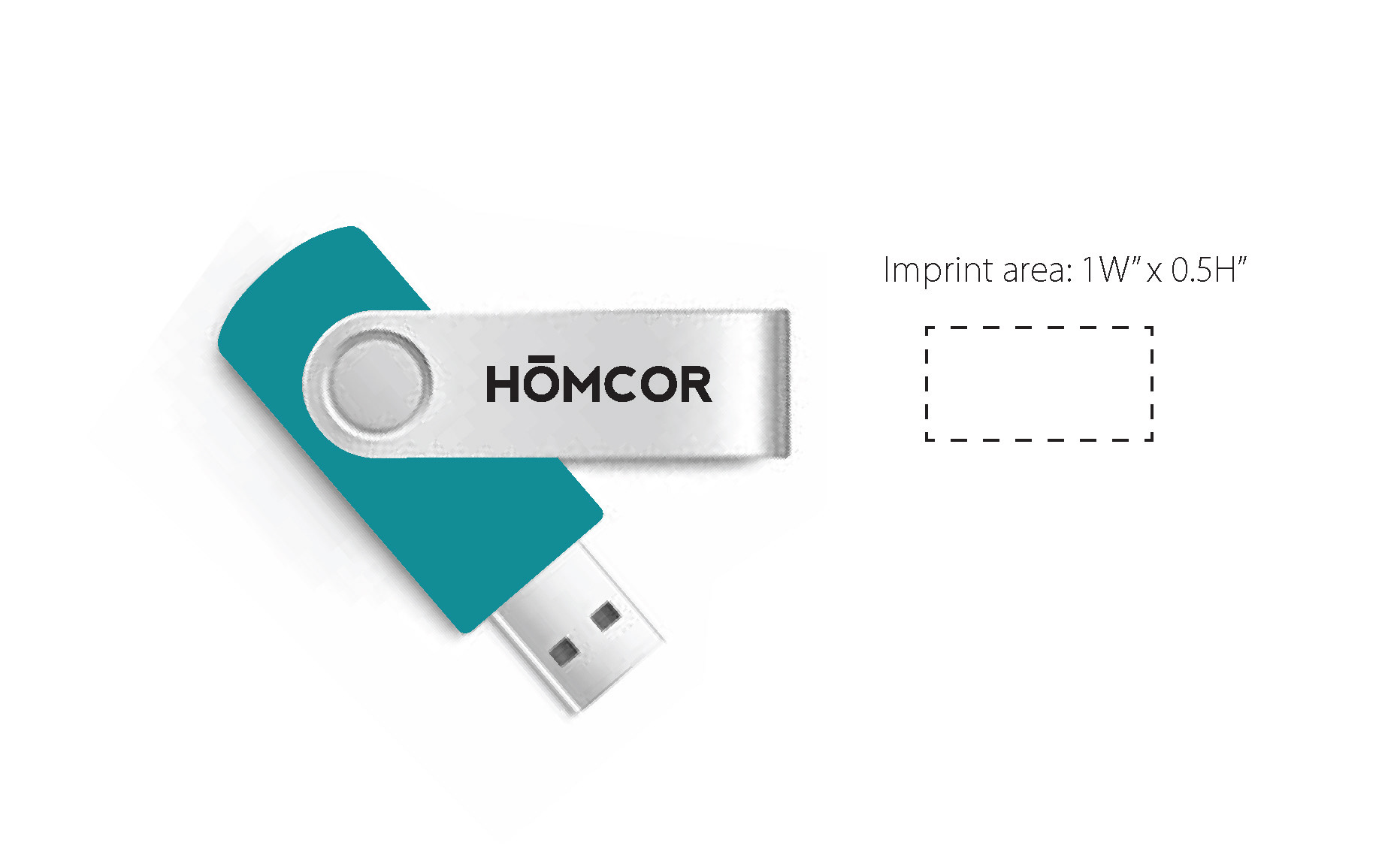
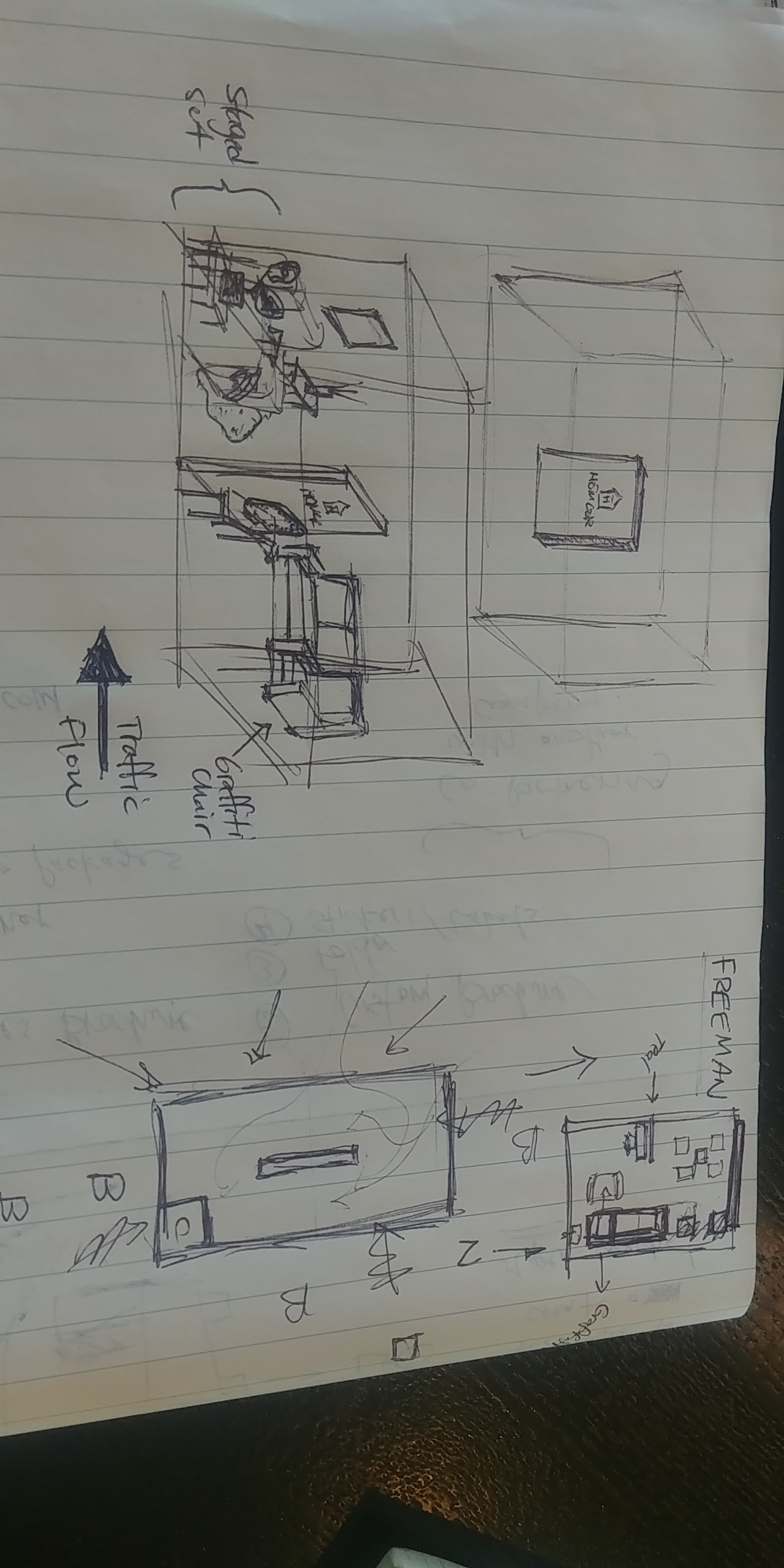
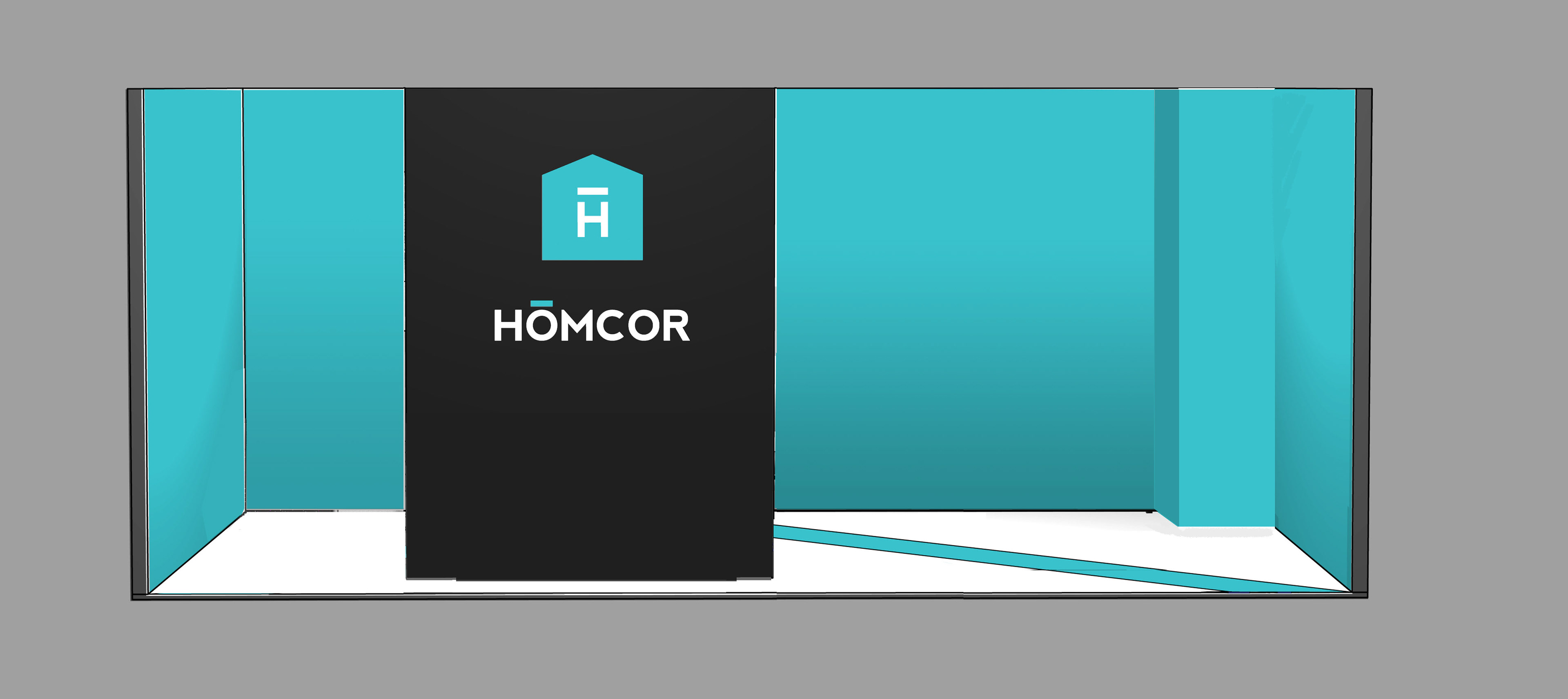
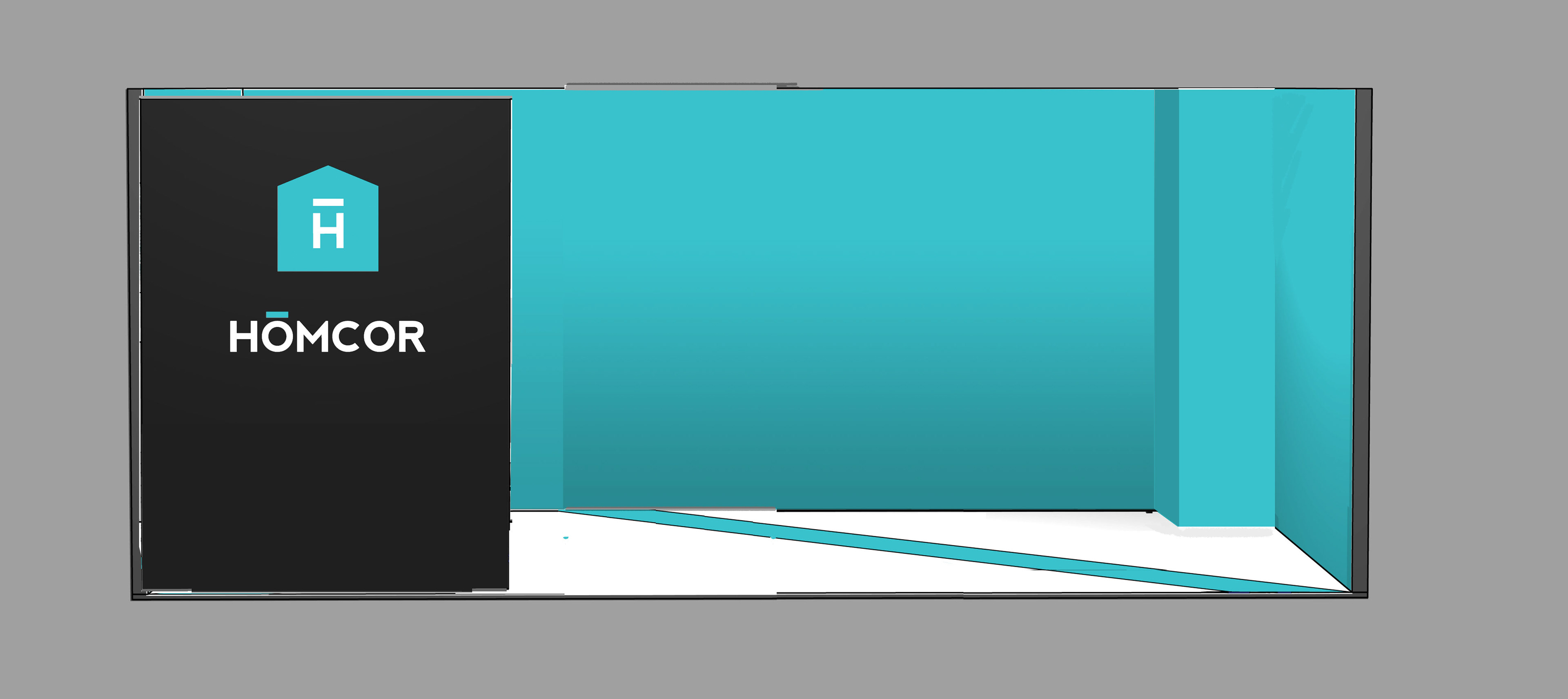
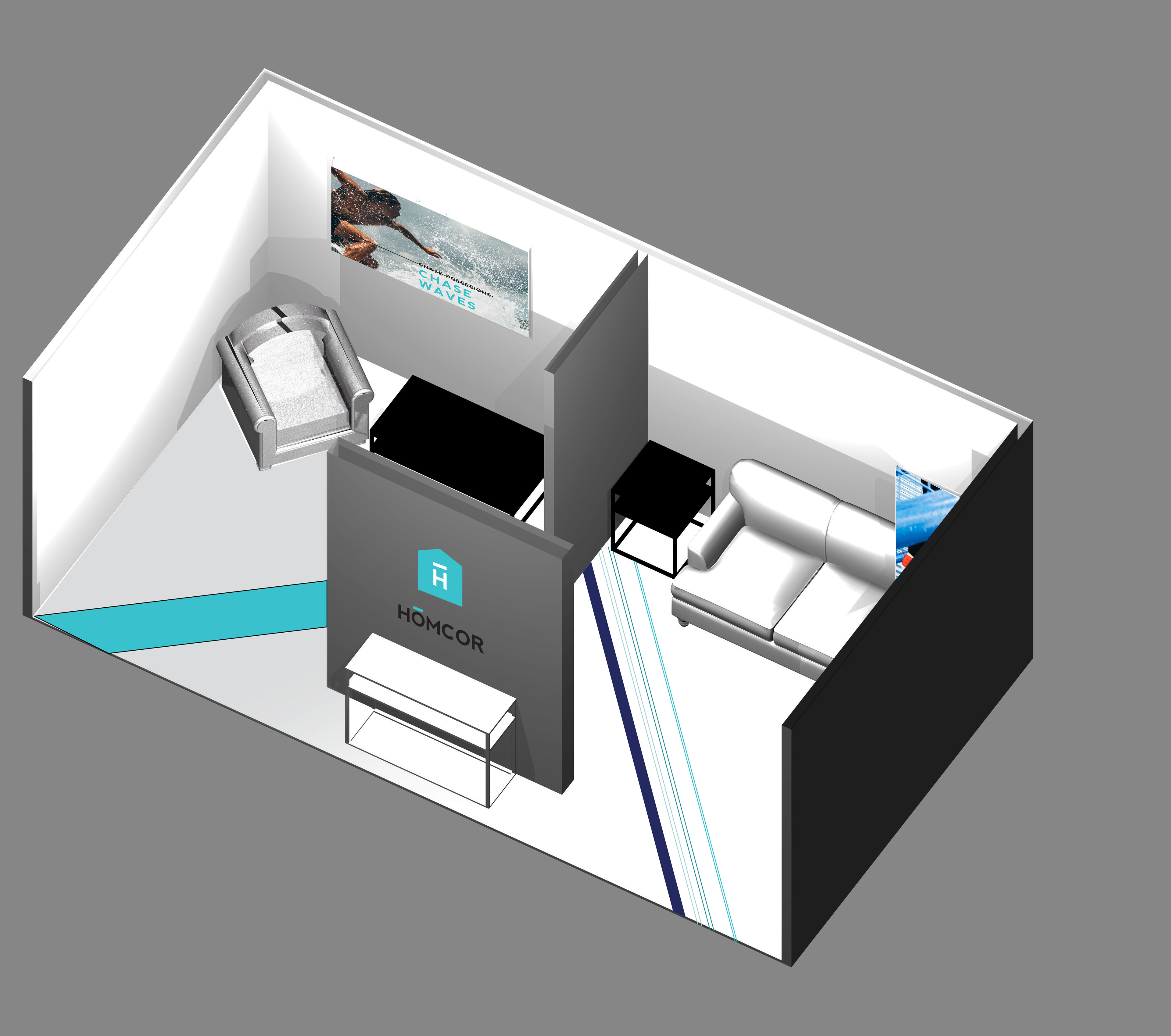
Aside from design and layout, I conducted a brand strategy session in order to understand the HOMCOR business objectives and the audience needs with the purpose of re-branding the company. I also lead the creative direction and art direction for the staging (visual design), photography, and I managed the print production for all the branded assets including lookbook, catalog, flyers and promotional items. I also concepted and designed a small tradeshow booth for them and a short introductory video to play at the trade show.
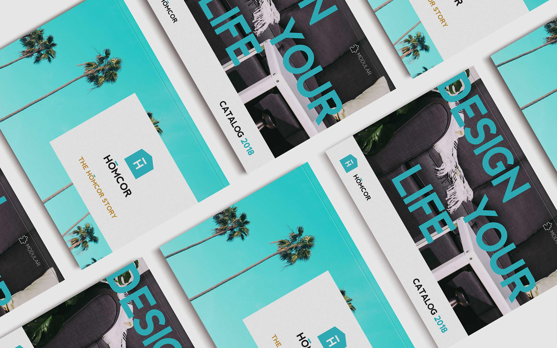
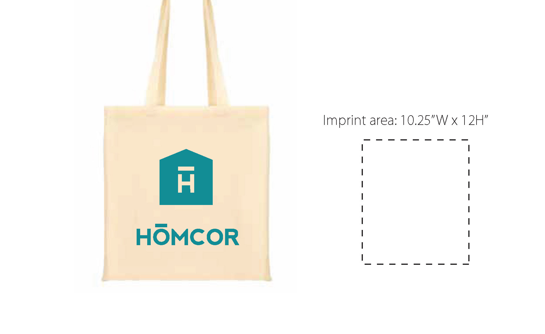
The owners derived the name HOMCOR by combining the words HOME + CORE = HOMCOR, thinking that such would emphasize that home goods are like the core of the home. The old logo mark looked like a generic piece of clipart with a random typeface for the logotype. Since a name change was not possible at the time, I suggested adding a macron over the letter "o", like this ō in order to clarify the proper sound of "home" even when spelled "hōm". I chose to further clarify the idea of "home" by utilizing a clean and minimalist home symbol and combining it with the distinctive look of the macron over the H in order to allow it to be used as its own recognizable branded design element. The construction of the new logo mark also allows it to versatile in order to adapt it to future brand lines, such as the addition of the upcoming HOMCORx brand.
The owners derived the name HOMCOR by combining the words HOME + CORE = HOMCOR, thinking that such would emphasize that home goods are like the core of the home. The old logo mark looked like a generic piece of clipart with a random typeface for the logotype. Since a name change was not possible at the time, I suggested adding a macron over the letter "o", like this ō in order to clarify the proper sound of "home" even when spelled "hōm". I chose to further clarify the idea of "home" by utilizing a clean and minimalist home symbol and combining it with the distinctive look of the macron over the H in order to allow it to be used as its own recognizable branded design element. The construction of the new logo mark also allows it to versatile in order to adapt it to future brand lines, such as the addition of the upcoming HOMCORx brand.
Brand Strategy, creative direction and graphic design by Bryan Jimenez. Photography by Brian Romo. Staging & visual design by Allie Kolias. Videography by Misa Garcia.

Old HOMCOR logo
Rebranded HOMCOR logo